Preferences & Usability
For each of these projects I was trying to answer a foundational question, the answer to which would shape operational or design strategy. My goal was to elicit a strong signal, knowing certainty was not possible. Lyssna.com (previously UserInterviews.com) was a crucial tool for all.
After this digital experience, would people sign up?
We advertised a coaching program on Facebook to people with Medicaid insurance. We knew the program was effective, but could we convince people, through our digital process, to sign up?
| Approach: Think aloud interviews (moderated) |
| → Recruited participants on UserInterviews.com |
| → Walked them through the experience, from (a) ad to (b) program site and description to (c) sign up form; asked questions throughout. |
| Insights |
| → Word choice had strong impacts on perceptions of trust. |
| → Transition from program site to sign up form triggered suspicion. |
| Outcomes |
| → Revised content to strengthen perceptions of trust. |
| → Modified process to eliminate second transition. |
| → Developed two personas to guide future work, socialized learnings across departments. |

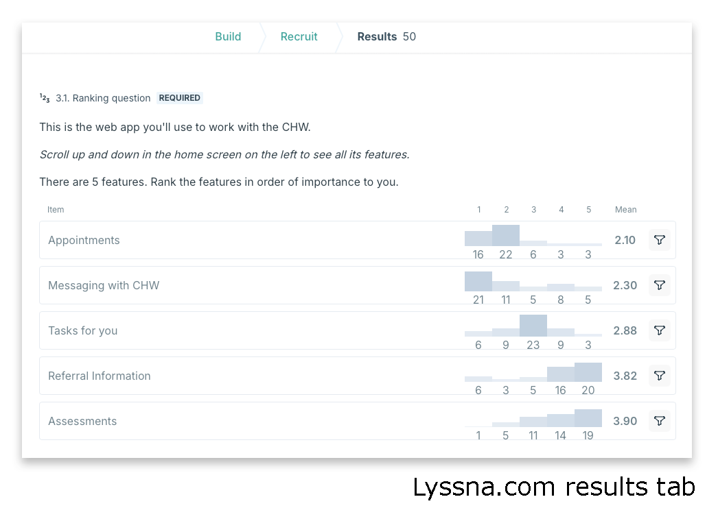
Program App: What features would clients prioritize?
As the UX-er, part of my job is to advocate for end users. Preference testing via online platform can be an effective tool for learning to better design decisions.
| Approach: Ranking preferences (unmoderated) |
| → Recruited a panel of 50 client-like people. |
| → On Lyssna.com they reviewed a scenario and app, prioritized five possible features, and described their reasoning. |
| Insights |
| → Referral Info ranked much lower than we had anticipated. |
| → Participant comments about “appointments” included several ideas for future features. |
| Outcomes |
| → Re-designed app home screen to reflect client priorities. |
Program App: How would clients prefer to stay secure?
We believe this app will enable clients to build effective working relationships with their Community Health Workers.
A fear was that a login process could keep clients and their information safe – but also became a point of friction that kept them from regularly using the app.
| Approach: Prefrence testing (unmoderated) |
| → Recruited participants on Lyssna.com |
| → Presented three login security options; asked for top preference and description of reasons. |
| Insights |
| → Three preference clusters of equal size emerged. |
| → Sending a one-time code(option C) was least popular among older participants. |
| Outcomes |
| → Ruled out Option C because many clients are 50+ |


How would clients prefer to share sensitive information?
We hypothesized that potential clients would be more likely to share sensitive information about issues like food insecurity, unstable housing, or loneliness if they could do so via a private, digital channel.
| Approach: Online survey (unmoderated) |
| → Screened for a panel of 50 client-like people using Lyssna.com |
| → Administered a 12 question survey online. |
| Insights |
| → Respondents preferred private, digital channels by 3:1 for most sensitive topics. |
| → Respondents' sensitivity varied by topic. |
| Outcomes |
| → Provided further evidence to design + build a digital self-screening tool. |

When receiving groceries as a program reward, would clients prefer digital ease or control over groceries?
TBD.
| Approach: Online survey (unmoderated) |
| → Screened for a panel of 50 client-like people using Lyssna.com |
| → Administered a two choice preference test; required written explanation of choice. |
| Insights |
| → 75% of respondents preferred a more elaborate digital sign up experience - including submission of credit card info - in exchange for choice over what items went in their cart. |
| Outcomes |
| → We are designing the more elaborate sign up experience such that clients can select the items to go in the cart. |

Testing usability in a prototype for a revamped public site managed by the federal agency SAMHSA
At ICF I was UX Researcher on a year+ project to redesign Substance Abuse and Mental Health Data Archive (SAMHDA)'s website overhaul. Usability testing was one part of that project.
See the detailed case study here: SAMHDA Website Overhaul
| Approach: Usability testing (moderated) |
| → Wrote facilitation guide to probe questions around navigation, labeling, and use of redesigned library catalog search tool. |
| → Moderated 9 sessions with past users of datafiles.samhsa.gov |
| Insights |
| → Content: Some confusing labels; need for transition texts on key pages. |
| → Function: Navigation dropdown hover issues; purpose of interactive tool unclear. |
| Outcomes |
| → Design and development team used the findings to revise the prototype. |
| → Moderated five usability sessions on revised site; all issues resolved. |